Featured Image Above the Fold?

Joined
Nov 11, 2021
Messages
295
Likes
56
Degree
0
Okay, so I heard some people say to not have a featured image at least not above. They say to always have it under a few paragraphs or so.
Do you guys agree with this? Is this ALWAYS better? Or is it better to have it like how this guy has it:
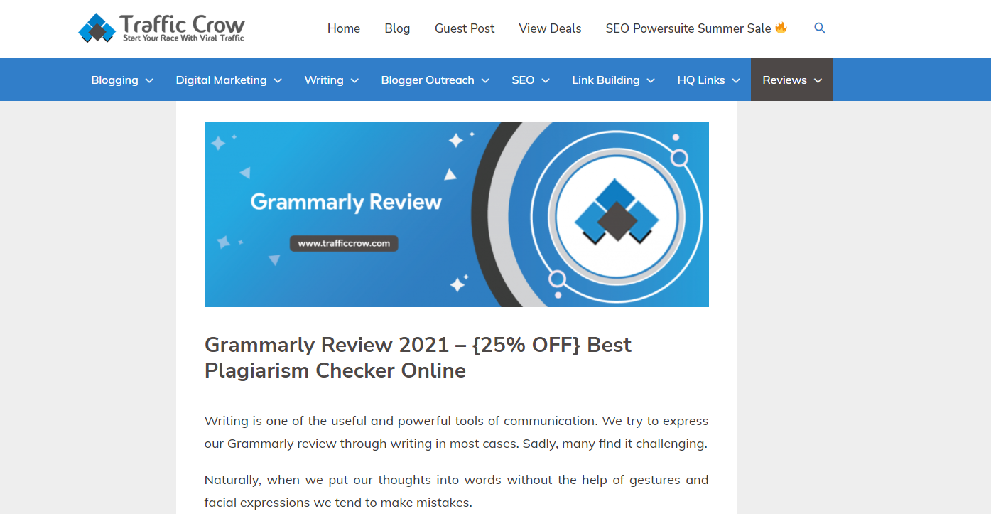
ee910ec046f29fbf50aa08ceef2b39cf.png

Cus on mine you need to scroll a little before you can read the things. What would you say is optimal? Also, would you guys suggest adding a large Pinterest pin at the very bottom IF your niche is good for pinterest??

Also, do you think it's a good idea to have larger images I would say like 1024 x 520 or 1024 x 620 on the blog posts for a lot of the headings? This would require more scrolling. Recently I also made it so I have better/higher spacing on my blogs along with a higher font so that it looks really nice on mobile.

What image size would you say is optimal for a site that is planning on taking advantage of ads as well as affiliates?
 
I usually don't use featured images on affiliate review type posts and I write short intros.

Then the images of products are one scroll away.

I don't think the size of the image matters much if you do use them.
 
With the "Above the Fold" algo change back in the day every pixel mattered. I got boosts by making my navigation shorter vertically, having featured images below the fold, etc. Google wanted "content" above the fold, meaning text.

This was one of the rare instances where most everyone ignored Google, to the point where Google quietly accepted defeat and now considers the featured images as "content". This is how I viewed the silent battle being waged, anyways.

But still, in the present, you want to think about your First Contentful Paint and your Largest Contentful Paint. The featured image is going to be the largest block of "stuff" loading up there on desktop anyways. On mobile it might not "physically" be the largest any more but it'll still have a large impact on the payload required for the first contentful paint. You shouldn't lazy load anything above the fold either.

So by pushing the featured image down some, you can quick load the text and get better scores on those user experience metrics anyways.

And no, don't use images for headings. Use H2's and H3's so you get on-page points. It might look fancy and feel cool, but it's bad practice and will slow you down when you try to reach scale too.
I am saying having images under the h2/h3 tags. It should boost SEO shouldn't it to have more multimedia on your page?
 
Do you guys, SEOs in particular, ever consider the visitors when making your decision? When was the last time you, personally, went to a page that didn't have images or an image at the top and read the content.

The computer is a visual medium: images, videos - these are how visitors related to your content. No one wants to read a wall of text, that's why I also add images/gifs and videos to my content HERE at BuSo.
I agree with images but, what about like the featured image? IS that necessary? what do you think? I recently removed it because I think it makes the user not have to scroll when they are on the mobile.
Should I revert back to what it was before? I always add images below and stuff but, I was wondering about the featured image because I saw HIGH traffic sites on my NICHE which are ranking TOP without no featured image but they have few images as you scroll down.
 
Should I revert back to what it was before?
At the end of the day you've already come to a conclusion and are just looking for someone here to validate it. If you aren't concerned about the users then do what you think makes sense. It's clear you've made up to your mind.
 
Splittest it.. It depends on Subject, which ever gives just the highest time on site / lowest bouncerate, keep that. User signals > your feelings.
 
Back