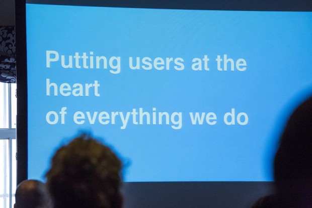
gov.uk - learning from an awesome government website

emp

BuSo Pro
Joined
Nov 7, 2014
Messages
556
Likes
583
Degree
2
test-620x414.jpg


For all people interested into making a great user experience.

www.gov.uk - This is the UK government website - no deisgn fluff, but great user journey. simple and helpful
https://www.gov.uk/performance/site-activity - these are the stats (impressive)

The stated goals
https://www.gov.uk/government/publi...-business-plan-april-2014-to-march-2015#govuk

Mission statement
Simpler, clearer, faster access to government services and information.

The tools they use to enable the site to handle the load and be as fast as it is:
https://gds.blog.gov.uk/govuk-launch-colophon/

And the blog of their dev team:
[08:16:24] emp: https://gds.blog.gov.uk/

I then got to the UK open data initiative
http://data.gov.uk/data/search

...and I'll be in my bunk

This is what good governmewnt service on the net should look like ... take notes, guys.

  • Fast
  • Transparent
  • Insanely helpful to the user

Could your sites do better in these areas?

::emp::
 
http://lmgtfy.com/?q=site:accountingweb.co.uk+"gov.uk"

I think a while ago I became aware of gov.uk changes on accountingweb. A lot of people there were complaining about HMRC materials and guide changes and moves to gov.uk. But I think that complainers were conservative people afraid of change. These accountants had the problem that tax information given to individuals on the gov.uk website around Q3-Q4 2014 were vague and inaccurate.

Still, I think that the government had a good idea of consolidating their services on one site. Websites should have the same goal of putting the users first. I don't like the UK otherwise, the royalty, conservative minded people or religious maniacs, but that's just my rant.
 
From all I heard (I personally do not live in the UK) the website is regarded as being awesomely helpful.

If some info is incorrect.. I think that happens in that size.. and maybe even was bad before.
Also accountants have a very vested interest in stating info on the website (for free) is incorrect vis a vis their services (for money).

::emp::
 
I've got to say as a UK resident that it's a lot better than it was... Although I'm not so sure I've met any religious maniacs in all 25 years of living here. lol

On another note @emp I love that you dig this sort of site because this kind of UX is what I've built many times over on various client projects just to have them shoot it down. It's really nice to know I'm not the only one who likes this kind of approach.
 
Hey @RomesFall

Yeah, I dig that kind of thing because that is where I am coming from.
Very first web dev / dev job was in exactly that area.

Huge web portal accompanying the search engine fireball.de - we did a full music section, youth magazine, etc.. and actually wrote the CMS for their portal.
Other than that, our customers were libraries in Germany and Spain, as well as other info portals.

Where I am working now, we do the same thing.
Over 60K publications on international security, 1000s of Audio files and videos, articles, etc... knowledge management system in the background, advanced search and advanced multi dimensional filtering available for the users.

So yeah, I dig that kind of thing.

::emp::
 
Back