How many images should I use per 1k words?

Joined
Jan 23, 2022
Messages
10
Likes
0
Degree
0
What are your views on how many images per 1k words of content?
I'm trying to find a compromise between page speed and user experience.
The serps seem inconclusive and it makes it even harder to gauge because they are full of adverts

Many thanks!
 
Page speed shouldn't be an issue if you're resizing your images properly, optimizing their payload size, and most importantly of all, lazy loading any images below the fold.

I don't think having some kind of rule where you include X amount of images per X amount of words is really that useful. How many you use will be dictated by the type of content and the needs of the content, as well as the needs of the user to understand something being discussed in the content.

That being said, I'm not a fan of articles that have a featured image at the top and no more images below that. I think that misses an opportunity to use alt texts, and to break up walls of text to help entice the reader to keep scrolling and looking onward.
 
What are your views on how many images per 1k words of content?
I'm trying to find a compromise between page speed and user experience.
The serps seem inconclusive and it makes it even harder to gauge because they are full of adverts

Many thanks!
Personally, I think it really depends on the content and niche....what you're talking about in the post.

I have a site in a hobby niche, and for a lot of the tutorial articles on that kind of site, you need a picture for almost every step, to demonstrate how the step should be done. That's a picture for every 1-2 short paragraphs.
That's one end of the spectrum.

If however your topic is somewhat abstract (eg philosophy or religion) and doesn't really require pictures except to illustrate a few concepts, then 1-2 pictures per 1000 words would be just okay. That's in addition to the header image at the top of you have one.
That's the other end of the spectrum.

Anything in between is fine, as long as your content is properly formatted with short paragraphs and appropriate spacing and headings.

So I think it varies widely depending on topic, and is not something you can really put a range to (within reasonable limits).

IMHO, the focus should be on optimal user experience, whatever illustrates your point best in a way that makes your audience happy is the way to go.
Rather than a certain ratio of pictures per thousand words.
 
I had this question as well. Everyone seems to say "Oh it's based on your content". Also, I was wondering what type of images to use exactly. Like some people here who do AMA claim they have an image guy who does "unique images" but they don't specify what type of images. Anyways so ima answer it.

I would say do more than your competitor.

If your competitor does 2, you should do 4. If your competitor does 10, you should do 15.

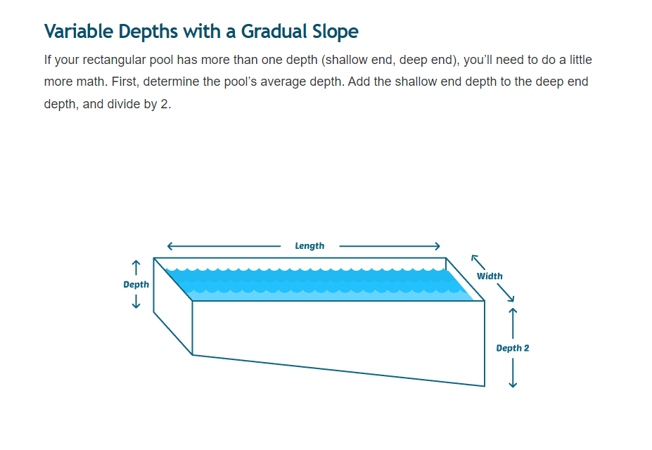
Now, if you are not lazy you should include a REALLY nice image within 700 words of your article. Like an infographic that sums things up or something like ACTUALLY useful. Like a chart or something like this for some swimming website:
9b3cd96517a94b205c6847b65aeb24a9.png


For the rest, you can just add stock photos underneath each h2 or maybe even h3's. (Again depends on the competitor. If your competitor has really useful images and not just stock images, what I am saying with stock images won't work so that's why it depends on your competitor.)

Also for the stock images, you want to add your brand logo/website at the bottom right, then you can maybe find your images used by other sites and claim that you own them and build backlinks that way. But, another benefit of these stock images other than spacing things out and stuff is others might use images from your site onto theirs so technically speaking the more images you have the more of a chance they will try to take one.

Not only that but, by having more images you can use more alt text like Ryuzaki said but see I used to think like "Oh come on Google really doesn't look at the alt text". Until I saw this one guy said "all you need to rank is have more images, more alt text with that keyword ur tryna rank for, higher keyword density, and more words". Now I'd ignore what he says but, his website was ranking for a pretty competitive keyword and this guy said he doesn't do any backlinking.

But I think I bought like easywins thing by some guy, it was like 70 or more "EASY WINS" to add to your site. basically, he had 1 tip on there which said at least have like 4-5 images as it increases ad revenue. So I guess it may increase AD revenue.

The latter paragraphs are borderline mindless drivel.

You note:

"Everyone seems to say "Oh it's based on your content"

The reason everyone in your thread said that, is because it's true.

This exact question came up in another thread and my response is here.

A TL;DR: Regardless, you should be providing images to better serve the user, that's it. Think about it this way, when you were a kid in school, did you enjoy reading page after page of text? I'd wager to say that most people didn't. Rather, treat them like they're children and serve them both text with an accompanying image - like a picture book.

Nobody can state - Use X amount of photos for Y amount of content - it's SERP dependent and based on YOUR content and niche.

No joke, my outlier ass has got to confuse folks like you when you run my sites through your on-page tool.

You should create images so that they better serve the user. In your example of the pool, that's a great image; It explains what they wrote and what their sub-section is about.

Yet in your drivel you said - "For the rest, you can just add stock photos underneath each h2 or maybe even h3's"

You sound like Professor Utonium from the Powerpuff Girls - Slap together Sugar, Spice, and everything Nice.

Gotta work right?

"Also for the stock images, you want to add your brand logo/website at the bottom right"

Why advise infringing on someone's copyright? I'm from the US and I wouldn't advise doing this.

But I think I bought like easywins thing by some guy...So I guess it may increase AD revenue.

Sounds like money well spent big dog.

book.gif
 
Nobody can state - Use X amount of photos for Y amount of content - it's SERP dependent and based on YOUR content and niche.

This. Images are there to improve your content's presentation for your particular target audience. :wink:
• That includes their search intent. Their content consumption needs. Their viewing preferences. Their content sharing habits. And their devices. Among other things ...

—> And with this diverse set of data points to work on, it's likely impossible to come up with a testable, repeatable, scalable one-size-fits-all tactic for the "right" number of images to use for X number of words per Web page that applies to many, let alone most, niche audiences. :D

Again, I'll reiterate:

"No joke, my outlier ass has got to confuse folks like you when you run my sites through your on-page tool."

You keep plugging and chugging though homie; Whatever works for you.
(This was meant towards Peppermint (it came across as towards you lol.))
 
(This was meant towards Peppermint (it came across as towards you lol.))

:wink: Nah, it didn't come across to me like that. But for those who skim quick and can't be bothered to read and absorb? Probably. But I don't do that. I read thoughtfully. So no worries. :D
 
Some of my posts required technical diagrams and I couldn't find any good ones online so I made them using a tool online.

Like others have said try and be useful with your images.
 
This. Images are there to improve your content's presentation for your particular target audience. :wink:
• That includes their search intent. Their content consumption needs. Their viewing preferences. Their content sharing habits. And their devices. Among other things ...

—> And with this diverse set of data points to work on, it's likely impossible to come up with a testable, repeatable, scalable one-size-fits-all tactic for the "right" number of images to use for X number of words per Web page that applies to many, let alone most, niche audiences. :D

As someone who's blind, what kind of description in the alt text would help you with images instead of just stuffing keywords as alts?
 
As someone who's blind, what kind of description in the alt text would help you with images instead of just stuffing keywords as alts?

Thanks for asking. I prefer brief yet descriptive alt text for images, i.e. For a photo of a cat, I don't want to have my screenreader read something like "best catfood 2022", nor a lazy attempt like "cat". :wink:
• Instead, I want to know what kind of cat it is (or at least how it looks), where it's at, and what it's doing, i.e. "vibrant picture of fat black alley cat on a kitchen table, eating".
—> I do hope Google factors this into their Google Brain's SERP algo soon (and gives it considerable weight). It'll give me and my blind peers so much value. :smile:
 
Page speed shouldn't be an issue if you're resizing your images properly, optimizing their payload size, and most importantly of all, lazy loading any images below the fold.

I don't think having some kind of rule where you include X amount of images per X amount of words is really that useful. How many you use will be dictated by the type of content and the needs of the content, as well as the needs of the user to understand something being discussed in the content.

That being said, I'm not a fan of articles that have a featured image at the top and no more images below that. I think that misses an opportunity to use alt texts, and to break up walls of text to help entice the reader to keep scrolling and looking onward.
What do you think the optimal size is? I have been using Short Pixels, and I compress them with Tiny.png. My image size is usually 1280 x 720. Is that too large still? Thanks in advance.
 
The image only enhances the content of the page.
No need to think about the number of images. The image must be relevant to your content.

Remember, a picture is worth a thousand words.
Therefore, think about what kind of image you post, because this can lead to a decrease of traffic from some channels.
 
However many helps you get your point across in your article.

Just be aware that there are some search intents, that just want PURE pictures. You'll see like the photo collection websites rank at the top if that's the case. For those, you can't win with words haha...
 
Back